October 19, 2023
| Article | by Ubuni Creatives Digital Advertising Team | Advertising,
Search Engine Optimization,
Public Relations, Social Media
Unleashing the Potential of Color Psychology in Advertising
In the world of advertising, every element of a campaign is meticulously designed to achieve one primary goal - capturing the attention of the audience. One often underestimated, yet immensely powerful tool in achieving this is color psychology. The strategic use of colors in advertising can greatly influence consumer perceptions, emotions, and, ultimately, purchasing decisions. In this article, we'll delve into the fascinating world of color psychology and explore how it can be harnessed to create more impactful and effective ads.
The Basics of Color Psychology
Color psychology is the study of how colors affect human behavior and emotions. Different colors can evoke a wide range of feelings and associations. For instance, red may symbolize passion and excitement, while blue might convey trust and reliability. Understanding these associations is key to utilizing color effectively in advertising.
Creating Emotional Connections
Ads that connect with the audience on an emotional level tend to be more memorable and persuasive. Color plays a vital role in creating these emotional connections. For example:
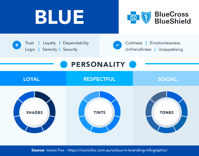
Blue: The color psychology of blue conveys trust, loyalty, dependability, logic, serenity, and security. It also conveys coldness, emotionlessness, unfriendliness, and unappetizing. Blue is the world's favorite color and is often associated with trust and reliability. However, it can also suppress appetites and convey coldness and unfriendliness.
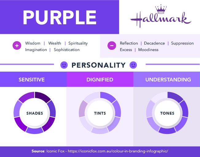
Purple: The color psychology of purple conveys wisdom, wealth, spirituality, imagination, and sophistication. It also conveys reflection, decadence, suppression, excess, and moodiness. Purple symbolizes royalty and superiority, making it an excellent choice for brands looking to signal a superior service or experience.
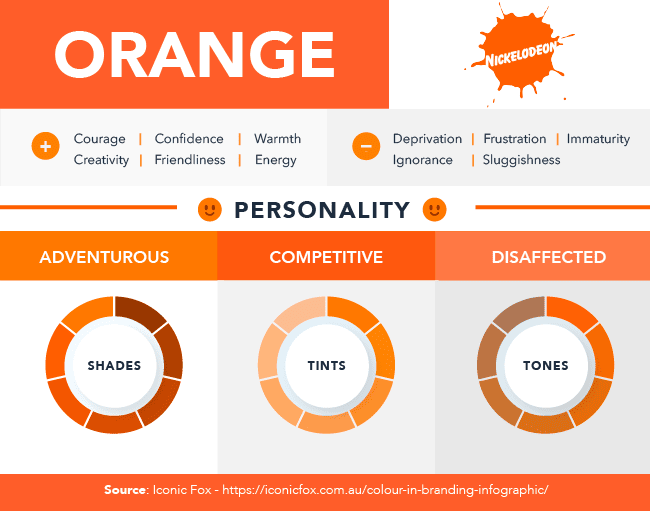
Orange: The color psychology of orange conveys courage, confidence, warmth, creativity, friendliness, and energy. It also conveys deprivation, frustration, immaturity, ignorance, and sluggishness. Orange is associated with fun and creativity but can also generate feelings of frustration and immaturity.
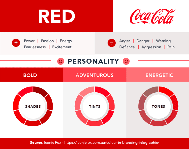
Red: The color psychology of red conveys power, passion, energy, fearlessness, and excitement. It also conveys anger, danger, warning, defiance, aggression, and pain. Red is associated with excitement and urgency, making it ideal for call-to-action buttons. However, it can also represent negative emotions like anger and danger.
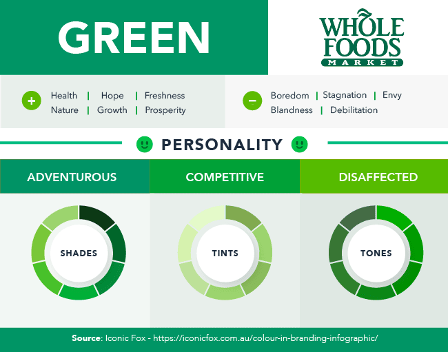
Green: The color psychology of green conveys health, hope, freshness, nature, growth, and prosperity. It also conveys boredom, stagnation, envy, blandness, and debilitation. Green represents life and relaxation, but it can also be associated with boredom and stagnation.
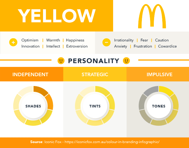
Yellow: The color psychology of yellow conveys optimism, warmth, happiness, innovation, intellect, and extroversion. It also conveys irrationality, fear, caution, anxiety, frustration, and cowardice. Yellow represents youthfulness and happiness but can also foster feelings of fear and anxiety.
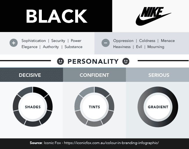
Black: The color psychology of black conveys sophistication, security, power, elegance, authority, and substance. It also conveys oppression, coldness, menace, heaviness, evil, and mourning. Black is often used to make a brand appear sophisticated and powerful, but it can also be associated with oppression and coldness.
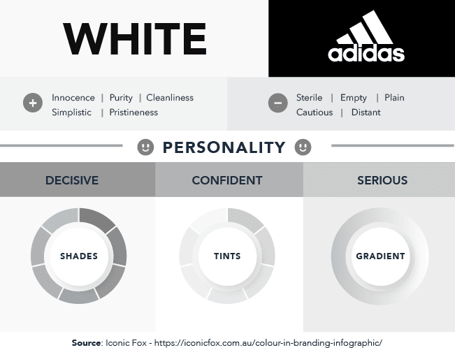
White: The color psychology of white conveys innocence, purity, cleanliness, simplicity, and pristineness. It also conveys sterility, emptiness, plainness, caution, and distance. White can evoke a modern, pure, and pristine look, but it can also feel sterile and plain.
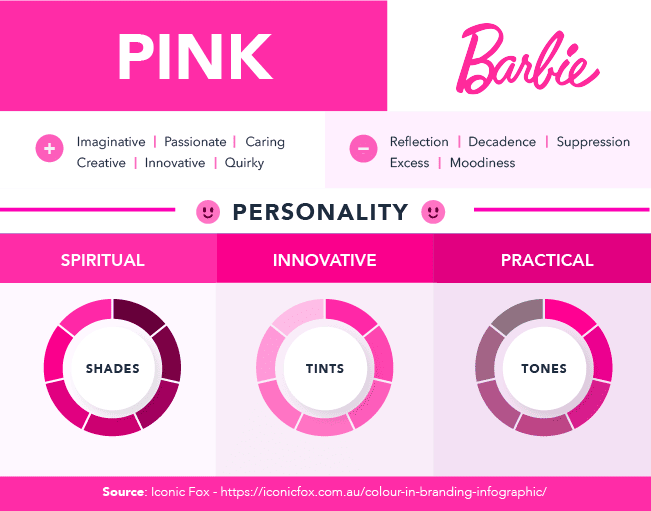
Pink: The color psychology of pink conveys imaginative, passionate, caring, creative, innovative, and quirky qualities. It also conveys reflection, decadence, suppression, excess, and moodiness. Pink is often associated with femininity and youthfulness, making it a suitable choice for brands aiming for a more youthful, imaginative, and quirky feel.
Cultural and Regional Influences
It's essential to consider cultural and regional differences when using color in global advertising campaigns. Colors can have varying meanings and associations in different parts of the world. For instance, while white signifies purity in Western cultures, it symbolizes mourning in some Asian cultures.
Creating Brand Identity
Consistency in color use can help establish a strong brand identity. Think about the iconic red of Coca-Cola or the distinctive green of Starbucks. These colors have become synonymous with their respective brands, making them instantly recognizable.
Testing and Adaptation
Color psychology isn't a one-size-fits-all solution. Successful advertisers often conduct A/B tests to determine which color schemes work best for their target audience. By analyzing data and feedback, they can fine-tune their ad campaigns for maximum impact.
Practical Tips for Implementing Color Psychology
Here are some practical tips for harnessing the power of color psychology in your ad campaigns:
Know Your Audience: Understand the preferences and associations of your target audience.
Use Color Harmonies: Consider complementary or analogous color schemes to create visually appealing ads.
A/B Testing: Experiment with different color combinations and measure the impact on engagement and conversion rates.
Consider Cultural Sensitivity: If your ads have a global reach, research the cultural connotations of colors in your target regions.
Highlight Key Information: Use color to draw attention to essential information or calls to action.
Color psychology is a potent tool that can significantly enhance the effectiveness of advertising campaigns. When harnessed correctly, it can create strong emotional connections with your audience, establish a memorable brand identity, and ultimately lead to increased engagement and conversion rates. So, next time you're designing an ad, remember the power of colors and use them strategically to leave a lasting impression on your audience.
